Tuesday, November 22, 2016
Monday, September 26, 2016
Friday, September 09, 2016
Wednesday, August 10, 2016
Tuesday, February 24, 2015
Thursday, February 20, 2014
⡁⡨⡺⡳⠟⠊⠉⠁
I'm a big fan of that rough, unfinished look. I imagined the above as sort of a conjured warrior in a constant state of flux, never satisfied to be still. Contrasted with, well, bright passages of color. Mixed media, photoshop.
Tuesday, February 04, 2014
Friday, January 31, 2014
Porcupine social
Or, perhaps an Echidna, as my brother dutifully pointed out.. Although he's a little on the large side.
Barnyard Bliss
Concepts for a farming game that got canned.. Sigh.
I was shooting for that classic, old Warner Bros vibe. I also borrowed heavily from the art style in Home on the Range (Disney).
Pencil and photoshop.
I was shooting for that classic, old Warner Bros vibe. I also borrowed heavily from the art style in Home on the Range (Disney).
Pencil and photoshop.
Wednesday, January 15, 2014
Tropical construction
Basically, you have to keep upgrading your huts to give the players something to do. (Hence the ongoing renovations). The little fish on the bottom one tells you that its a storage warehouse for food :D
Friday, November 09, 2012
Newd rawings
I stopped figure drawing for aages.. It took a lot of crappy drawings to get back in the swing of it and I finally feel like things are coming together again. Looking at them now, it's kinda funny how they're all facing the same direction.
charcoal, 18 x 24
Monday, October 22, 2012
Rust bucket 3000
Yeaaaaah, I like robots.. theyre great.
Nice to get away from the digital stuff and bust out the gesso, brushes and real paint!!
Ink and acrylic on masonite, summer of 2012.
Sunday, October 11, 2009
Updates?? What updates?
I must apologize to my loyal friends that stop by here from time to time for the lack of updates and any tumbleweeds that roll by.. Times have been busy and I can't show anything I've been working on. The fact I'm too lazy to do anything on the side lately doesnt help either!
Anyways, here's some logo work I did on the side for the good guys at Anthill Films. They're local, talented and quickly rising to the top in the world of Mountain biking films.
The films concept is basically this:
At the head of the trail you have never ridden, a friend turns with a knowing look and says… “Just follow me!” We’ve all heard it and depending on who says it makes a pretty big difference for what lies ahead. Whether it’s a good idea or not we almost always drop in. Now, riding alone is great. But let’s face it, we all ride harder, go faster, take more risks and have more fun when we ride with our friends. Follow Me.. coming Spring 2010
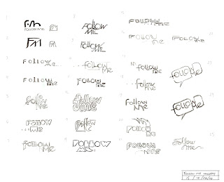
 Here's a page of roughs that I did to figure out our initial direction. We all liked the speech bubble concept so we went with it.
 Peep the demo Reel!
Anthill Films Demo Reel from Anthill Films on Vimeo.
Anyways, here's some logo work I did on the side for the good guys at Anthill Films. They're local, talented and quickly rising to the top in the world of Mountain biking films.
The films concept is basically this:
At the head of the trail you have never ridden, a friend turns with a knowing look and says… “Just follow me!” We’ve all heard it and depending on who says it makes a pretty big difference for what lies ahead. Whether it’s a good idea or not we almost always drop in. Now, riding alone is great. But let’s face it, we all ride harder, go faster, take more risks and have more fun when we ride with our friends. Follow Me.. coming Spring 2010
 Here's a page of roughs that I did to figure out our initial direction. We all liked the speech bubble concept so we went with it.
 Peep the demo Reel!
Anthill Films Demo Reel from Anthill Films on Vimeo.
Saturday, March 28, 2009
Tuesday, March 10, 2009
speedpaint - landscape
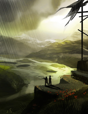 Big UP to David Levy for his knowledge and generosity with photoshop custom brushes.. I watched his gnomon workshop dvd and a lot of the brushes he creates and his tips on painting process came in pretty handy. The palette knife can be a tricky beast, but i can tell once you master it you can speed up your work a lot! Hope you like it.
Tuesday, February 10, 2009
Late night..
Thursday, January 15, 2009
Burlesque Life Drawing
Tuesday, January 06, 2009
Friday, October 24, 2008
Robots and Monsters!
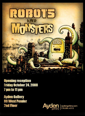 Hello All,
Tonight is the night for all you robot and monster lovers out there!
It's a group show and I've got some pieces on display. You can find all the info above.
If youre in town I'd love it if you could swing by!.. and if you're not don't fret -I hope to post a few photos afterwards.
(flyer design by peter ricq)
Chowder
It's a group show and I've got some pieces on display. You can find all the info above.
If youre in town I'd love it if you could swing by!.. and if you're not don't fret -I hope to post a few photos afterwards.
(flyer design by peter ricq)
Chowder
Jess
Friday, September 26, 2008
Cornwell Studies
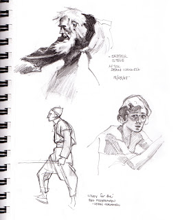 If I had a beard I'd probably grow one just like Skipper Steve up top..
These sketches are copied from some paintings and studies by Dean Cornwell: A true American badass. He trained under giants like Frank Brangwyn who, in my opinion, was one of the best hands down. Apparently there was a time when it was hard to tell a Cornwell from a Brangwyn painting because he was just that good. Unfortunately its hard to find much material on this guy even though he was one of the premier illustrators of the 20th century. Dean Cornwell: Dean of Illustrators seems to be the best all round book on him, however its out of print and tres expensive.. Anyone interested in parting with a copy??
Monday, September 15, 2008
Moody Environment Number 1
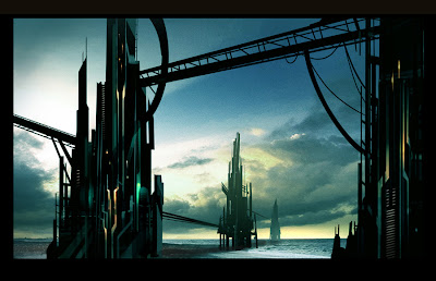 Thought I'd take a break from the characters and focus on some BG's.. I was striving for those uber cool outlandish sci-fi concepts your man Sparth effortlessly cranks out. I feel the walls could still use a bit o texture to them. Any crits, comments or tips are welcome! Thank you to the good souls posting on Flickr for the sunset photo...
Wednesday, August 06, 2008
ROBOTS!!
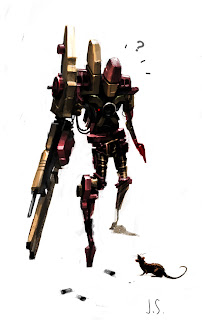
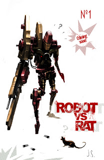
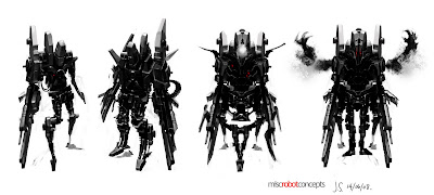
Here's a few robot concepts I've been working on in my spare time..
I added some text to one version to enter it in a cover art show my friend organized a few weeks ago. Some healthy influence from Ashley Wood but wonky enough that I can still call my own. And yep, you guessed it, all with no backgrounds because I'm quite lazy these days..
The bottom ones are basically recycled / mirrored images of the 1st one. Duplicated, flipped and multiplied in PS to create some interesting shapes then painted over top of..
Wednesday, June 11, 2008
Miscellaneous character concepts
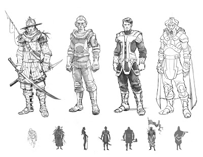 Mercenary, Pilot, space captain and sheik 3000. Heres a couple sketches i did for my portfolio. I've been gearing a lot of my recent stuff more towards the concept design field. Coming from an animation background, I feel it takes quite a bit of re-training of the brain to think and draw differently..
Wednesday, May 14, 2008
Football hooligan Step by step..
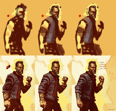 Some ego-maniac art director yawned all over my work, so I went home and painted this! Haha a little fire in the belly helps sometimes. A lot of my friends ask how i work in Photoshop and there really is no easy answer.. I guess the best way is just to show it.
I've decided to post a rough step by step of one of my favorite pieces.. I managed to save a few versions as it was coming along, and as you can see some images show noticeable progressions.. and others not so much! This is something that worked for me at the time, I've since built and experimented with different way of working and approaches.
- I had no idea what i wanted at this stage and it literally all started with a scribble. The basic masses and shadow are blocked in 1st with the dark brown and afterwards i started to use other tones.. about 4? the red and purple reflected light was an after thought.
- I paint/erase around the edge of the head to define the silhouette better. I continue blending colors in the face and slowly begin to find the form, keeping in mind the dominant light source from above.
- Some more minor tweaking around the head, and more blending. Yikes! He's lookin scary, I try and pull it back a bit.
- Chiseling out the shape of the figure with different background colors, i'm really enjoying it at this stage and thrashing around a lot.
- Almost there! Things are really unifying and you can see I'm playing around with different ideas for a tattoo. I was thinking psychotic UK football supporter and trying to sell that with the union jack, not sure where to put it either.
- BOO-YA! Complete. Used a photo for the tatti (I'm a big fan of the west coast native art) and pictures of my hands as well.
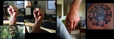 Heres some of the various refs i used. Ol Brendan gleeson had a pretty intense expression and i tried to get that same feeling in the face. I think he helped.
I really should use reference more often, as its such an invaluable tool, but i only tend to do so when i'm really stumped on something. Hope this was helpful!
Thursday, April 17, 2008
Wednesday, April 16, 2008
Cinema
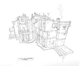
 Heres a little something i did for a video game that got canceled recently.. the movie that its based off (which i'm not quite at liberty to say yet) is still scheduled to come out this year. I was given a basic 3-D model to use as reference and embellished the rest of the details.
Pencil sketch colored in PS
Tuesday, February 19, 2008
More..
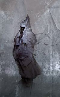 Well, you axed for it! I was messing around with some textures, overlay, painting and erasing and all around general color noodling and came up with this... Its going to get transfered on canvas, stretched and framed where it will finally end up as a mixed media piece as part of an art show i'm having this friday!! (49 Powell st 7pm-11pm for those of you in the area)
ciao for now
Wednesday, January 16, 2008
28th Century Druid
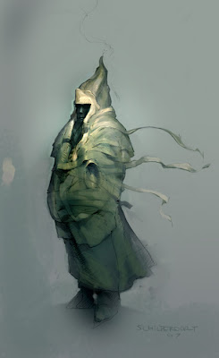 This piece is a bit of a tribute to all those early French Sci-Fi pioneers.. Moebius, Mezieres etc. I had a lot of fun doing it, its a bit of an escape from my usual style. It started with a line drawing I did at about 3 or 4 am one night, scanned it and started to color it a few days later.. Still have to finish it and put in some sort of background though. Hmmmm...
Subscribe to:
Comments (Atom)


